Even in today’s advanced digital age, posters are still one of the best ways to get across your message without spending a fortune. In order to get the most out of them you need to ensure the design is up to scratch. To help you with this, here are 5 design tips for school poster printing.
What is the poster for?
The starting point of nearly any marketing campaign is to understand the reason it is being created. Is it an event for pupils, or something that also involves parents and staff members? In order for the design to be communicated effectively your messaging needs to be clear and simple – if it confuses you, how will those looking at it feel? Also make sure the poster can be scaled up or down in size where required without affecting the impact of the design.
Who will be seeing the poster?
Never forget that you are designing this poster for other people to engage with and it is not solely a creative exercise for you to show off your artistic skills! Always have the core audience in mind, as everyone will interpret it differently and react in their own way. For example, pupils are younger than staff and parents and look at things from their own perspective. That will dictate the language, colours and images you include to create a connection with the audience. And never be afraid of looking around for inspiration to get your creative juices flowing.
What are the best colours to use?
Colours play a huge role in the design of any poster. Some of the world’s biggest brands spend hundreds of millions on market research, with the use of colour crucial to their success or failure. For example, green can be calming and is often related to the environment, while red is a more vibrant colour and is linked to remaining alert. Black and white is good for getting across formal information, while blue and white is good for I.T. related events. The use of colour in design sets the tone for how we respond, so take your time choosing the right one to suit your message.
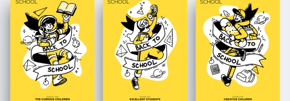
Why are images so important?
Similar to the way colour will impact the audience, the use of images will be just as important. Humans are visual creatures and can take a lot of information from the pictures and images they interact with. The image should complement the message and even enhance it in some way, capturing the viewer’s imagination by bringing to life the words on the poster. Wherever possible, always make sure the images are at least of 300dpi quality (saved as CMYK), as this is the minimum standard needed by a printer to ensure it comes out crystal clear.
What text should I use?
Once you have figured out the words you want to include in the poster, you need to make a decision on font style and size of the text. If the poster is for a fun event, you’ll want the font to convey that too, so stay away from rigid, formal styles. Are there any words you want the audience to focus on in particular? You may want to enlarge and accentuate these so they stand out and catch people’s attention. Try to avoid over-crowding the poster with too much text as the most successful designs are usually quite simple and effective in their layout.
At Printech Express, we specialise in educational printing for schools and colleges across the United Kingdom. We can provide school poster printing in a variety of finishes, perfect for promoting school events. Our friendly team can talk you through all the printing options via Email or over the phone on 01245 506066.